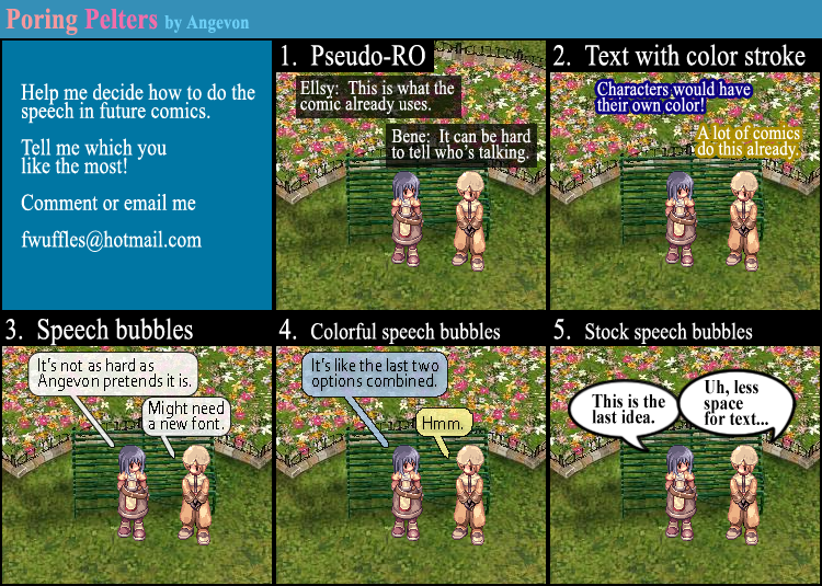


Angevon's Comments:
Personally, I think the dialogue style I have been using was cute at first, since it is based on how text is shown in-game in Ragnarok Online, but I think it's outdated and the text can be done a better way. But I don't know if any of these options are 'better' ...
You can also tell me how to modify any of these options to make them better, too. Or send me/show me another way you think would be good. I'm kind of at a loss, so let me know!

I like number 2 , each character with their own color (:
ReplyDeleteI think you should stick with what your doing now or text with coloured stroke!
ReplyDeleteI personally would combine the first two options. I kind of like the names at the beginning of the text mostly because I really suck at remembering names. Sure I would remember any of the old characters, like Kethios, Lavian, etc, but not any new ones that may be introduced.
ReplyDeleteI personally have no problem looking at the default as it is. I never had a problem trying to figure out who was talking, or in what order the people were actually talking in.
my vote's on 5, easy for viewers to see but more work for the writer as there's less words and so the words will have to be carefully chosen.
ReplyDelete1 if there a lot of space and low action
ReplyDelete2 if there a lot of action like in the last part of this last chapter
I like psuedo RO :(
ReplyDeleteI prefer the Pseudo-RO one...
ReplyDeleteThe 2nd option of colored text is nice, but could be hard to read sometimes :/
The colored speech Bobbls are another nice touch, that could come in handy.
I personally dislike the other versions...
You should also decide on how easy it is to make for you though ^^
I like both 1 and 2, but since I have problems with names, I will vote on 1.
ReplyDeletei vote for #1
ReplyDeletei think if u end up chooseing #5 u should use wild word or manga temple font
ReplyDeleteActually, I kind of like #4.
ReplyDeleteI like the original for the same reason, that it looks like the chat in RO. What you could do is keep it that way, but give it the little arrows the speech bubbles have. This way you won't have to be like everyone else with a speech bubble, but we'll be able to tell who is talking (although that was never an issue for me anyway since you put their names in front of the text)
ReplyDeleteI've always liked 1, I'm okay with 2 as well... combine 1 and 2? :D
ReplyDelete1 and 2 work for me.
ReplyDelete